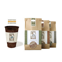
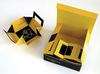
Graphic designs on a packaging explain a product description inside each container to consumers which describes pros and cons of a product. Information that a graphic designer should present to consumers are nutrients, nutrition facts, consumption instructions, storage instructions, production date, expiration date, product quality, and detailed information on the manufacturer.
What Kind of Typeface Should be Used for Graphic Designs?
Typeface is a primary foundation for packaging design. In general, font design can be done with two main methods. The first method, called a Display Face style, is to focus on using fonts to draw attention from audiences and readers, using fonts to be decorative, and using fonts to emphasize text. The style uses upper case which makes a design more distinctive, The second method, called a Book Face style, is to focus on using fonts to explain or describe contents. The style uses lower case text to explain or describe detailed information.
 In order to figure out which typeface to use in a graphic design, a designer should learn about font composition and the following issues: 1. Typeface, 2. Font characteristics, and 3. Sizes.
Choosing a typeface for a graphic design
1. Typeface appearing on each page of a book should be balanced in length and width to the reader’s eyes. (A typical size is 3/5. Width and 1 height)
2. Compound words each line in a page. Each letter has to be complementary to one another. Letter spacing should be appropriate for the design. The space between the lines of type in a body of copy should not be too thin because that plays a big role in readability which could be distracting and boring. The length of a line of type on each page should not be too long or too narrow because it would affect readability and would be hard for readers to locate the next line of type. Arranging lines on each page should have appropriate margin because it is easy to read and easy for publishing
3. Typographic contrast depends on typefaces and weights of fonts, and using color contrast between the paper background and the fonts
 4. The designer must select an appropriate type of font depending on reader conditions (considering people with eye sight problems including near-sightedness, far-sightedness, and colorblindness) and on surrounding environments such ad noisy, crowded, hot or cold environments. Letters that are used with belldor during a sunny day are supposed to have high contrast to be a perfect fit for the environment, but if it were to be a cloudy day, the contrast should be lower to enhance readability.
4.1 A vertical typesetting measurement uses a measurement unit called point which 1 Point is equal to 1/72 inches. The higher the number, the taller the letter size will be
4.2 A horizontal typesetting measurement uses a measurement unit called Pica which 1 Pica is equal to 1/6 inches. The higher number of Pica results in wider letter length
4.3 Letter spacing refers to the amount of space between groups of letters. Each typeface is distinguished from one another
4.4 Stroke, depending on each letter, consists of a maximum of four lines. When combining a set of consecutive lines for each letter, one should consider letter spacing, consistency, and create an appropriate sense of perception that retains the flow to the next letter
4.5 Optical volume considers a balanced volume and appropriate balance for eye sight
4.6 Letter Spacing Scale. Good text spacing should consider reader’s visibility (more than the width between letter spacing), readability, and self-searching system for letter spacing
 4.7 The baseline grid for curved fonts is typically designed to be higher than straight line fonts in order to have the visual effect that they are close in height. Curved fonts should be placed a little bit below the baseline grid which will create an illusion that the letters are sitting right on the baseline grid.
4.8 Margin: curved, italic, should be placed a bit over the margin which creates the reader’s perception that the text is right at the border line. If there was any spacing from the previous line, the last text should be placed at the end of the margin
4.9 Kerning is the process of narrowing down letter spacing of italic, curved letters and letters that create large blank spaces between each pair of letters and each combination of upper and lower case letters
4.10 Word spacing. Each word begins and ends with different shapes of letters. Word spacing should be arranged to be complementary among words and should be consistent. Word spacing density should be adjusted the same way as letter spacing
4.11 Headline Type. Every letter can be used as a Headline Type. Letter sizes can be as small as 14 point to 144 point or taller than that
4.12 Body Type, typically can be from 4-14 point to 8-14 point. Typeface should be chosen to match each body type. Each typeface offers different characteristics and should enhance the message and stimulate the audience. There are a few kinds of letters that are suitable for body type.


